

A Complete Guide to Technical Analysis and Swing Trading Like an Institution
A Complete Guide to Technical Analysis and Swing Trading Like an Institution
Educational content only. Nothing in this article is financial advice — it’s a detailed breakdown of a trading framework for informational purposes.

Most retail traders start with the same toolkit: a handful of indicators, a couple of trendlines, and a gut feeling. It’s easy to learn and it feels like trading.
But there’s a completely different world of market participants — banks, hedge funds, prop firms — who read price action through a different lens entirely: order flow, volume, and positioning.
This is where real technical analysis lives, and it’s a different animal from the RSI-crosses-70 strategies that flood social media.
This is a long, detailed walkthrough. It covers why price behaves the way it does at a mechanical level, the core technical analysis tools professional swing traders actually rely on, how to read volume and market structure like an auction, how to layer macro and positioning data on top of your charts, and how to build a repeatable entry and risk framework around all of it.
Table of Contents
Why Price Moves the Way It Does
The Building Blocks of Price Action
Support, Resistance, and Market Structure
Volume: The Missing Half of Every Chart
Auction Market Theory and the Volume Profile
Classic Indicators — What Actually Still Works
Reading the Macro Backdrop
What Drives Each Asset Class
Following Institutional Positioning
The Entry Models
Risk Management and Position Sizing
Building a Trading Plan
Common Mistakes and How to Avoid Them
Final Thoughts
1. Why Price Moves the Way It Does
Every market runs on an order book — the live menu of buy and sell offers waiting to be filled. A retail trader with a modest account can buy or sell “at market” and barely move the price.
The cost of that convenience, the bid-ask spread, is usually a few cents or a few dollars.
An institution trying to deploy hundreds of millions of dollars faces a completely different problem.
There simply isn’t enough resting liquidity in the book to fill an order that size at one price. Buying it all at once would mean sweeping through the book at increasingly worse prices — and unwinding the position shortly after could mean losing a staggering amount to slippage.
So large players don’t dump size all at once. They break enormous orders into thousands of smaller ones and feed them into the market gradually, sometimes over days or weeks, using execution algorithms designed to minimize cost.
This single fact is the foundation of technical analysis as professionals use it: because filling and later unwinding a massive position takes time, institutional flow creates persistent, gradual drift in price, and that drift leaves visible fingerprints on the chart — in volume, in the shape of consolidations, and in how price reacts around certain levels.
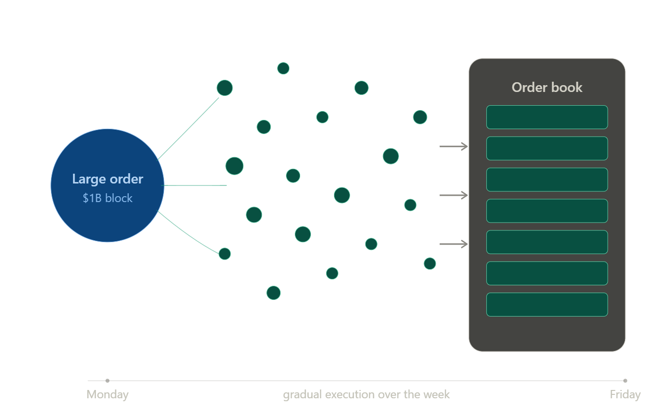
Academics call the resulting phenomenon order-flow autocorrelation — a run of buy orders tends to be followed by more buy orders.
Technical analysts call the visible result a “trend.” Understanding that a trend is really just the visible residue of a large, slow-moving order changes how you read every chart you’ll ever look at.
2. The Building Blocks of Price Action
Before layering on volume, auction theory, or macro context, every technical trader needs fluency in the raw language of price: the candlestick.
Candlestick anatomy. Each candle represents a battle between buyers and sellers over a fixed period — one minute, one hour, one day.
The body shows the range between open and close; the wicks (or shadows) show the full high-to-low range.
A long body with small wicks shows conviction in one direction. A small body with long wicks — a doji or a spinning top — shows indecision, often appearing right before a shift in control.
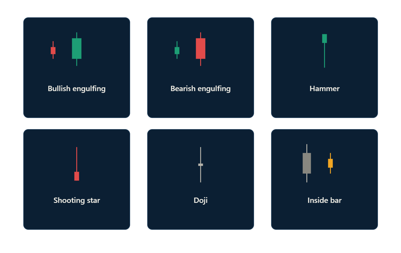
Common candlestick patterns worth knowing:
Engulfing candles — a candle whose body completely swallows the previous candle’s body, often marking a short-term reversal in momentum.
Pin bars / hammers and shooting stars — a long wick rejecting a price level, showing that aggressive buyers or sellers stepped in and were overwhelmed.
Inside bars — a candle fully contained within the previous candle’s range, showing a pause or coiling before the next expansion.
Doji clusters — multiple small-bodied candles in a row, usually marking indecision at a key level before a breakout or reversal.
Timeframe alignment. Professional swing traders rarely trade off a single timeframe. A common approach is a three-tier system: a higher timeframe (weekly or daily) to establish the dominant trend and macro bias, a medium timeframe (4-hour or daily) to map out structure and key levels, and a lower timeframe (1-hour or 15-minute) purely for entry timing.
Trading against the higher timeframe trend is possible but statistically harder — you’re fighting the direction the “big money” order is most likely still filling in.
3. Support, Resistance, and Market Structure
Classic support and resistance is often oversimplified as “a line where price bounced once.” Institutional-grade technical analysis treats these levels as zones of concentrated past transaction activity — places where a large number of orders were filled, meaning a large number of traders have a vested interest in defending or reacting to that price again.
How to actually map structure:
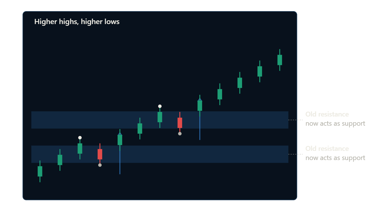
Swing highs and swing lows define the skeleton of a trend. A sequence of higher highs and higher lows defines an uptrend; lower highs and lower lows define a downtrend. The moment that sequence breaks — a lower high after a series of higher highs, for example — is the first technical warning sign that the drift may be shifting.
Zones over lines. Instead of drawing a single line, mark a zone spanning the wicks and bodies of the candles that reacted at that level. Price rarely respects a level to the exact tick; it respects an area.
Role reversal. A broken resistance level frequently becomes new support (and vice versa), because the traders who were trapped or hesitant at that level now have a new reference point to defend.
4. Volume: The Missing Half of Every Chart
Price tells you what happened. Volume tells you how much conviction was behind it. A breakout on razor-thin volume is far more likely to fail than a breakout accompanied by a surge in participation, because thin volume means few real participants have committed capital to that move.
Key volume signals:
Volume expansion on breakout — confirms genuine institutional participation.
Volume divergence — price makes a new high, but volume shrinks compared to the prior high. This often precedes exhaustion.
Climactic volume — an extreme volume spike, often at the end of a strong trend, can mark capitulation (in a downtrend) or blow-off euphoria (in an uptrend) — both classic reversal signatures.
Low-volume pullbacks — in a healthy trend, corrective moves against the trend typically occur on lower volume than the impulsive moves in the trend’s direction.
5. Auction Market Theory and the Volume Profile
This is where technical analysis stops being about lines and starts being about where the money actually transacted.
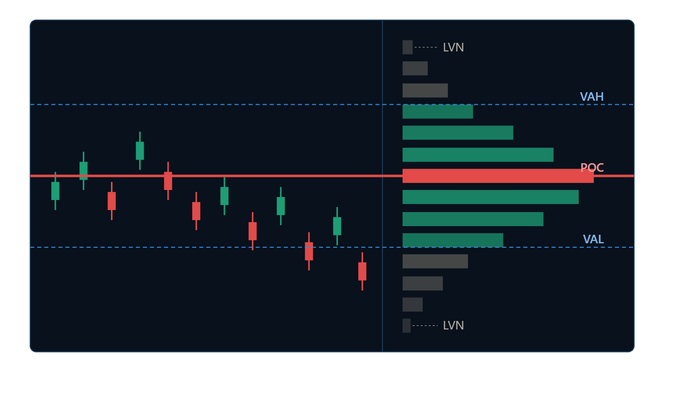
Auction Market Theory treats every market as a continuous double auction between buyers and sellers. Prices spend most of their time in balance — a range where buying and selling pressure roughly agree on fair value, generating heavy trading activity. Plot the volume traded at each price level over a session, and you get a volume profile: a horizontal histogram overlaid on the price axis.
Key volume profile concepts:
Point of Control (POC) — the single price level with the most volume traded. This is the “fairest” price in the range and tends to act as a magnet.
Value Area (VA) — typically the range containing roughly 70% of the volume around the POC. This is the fair value zone.
Value Area High / Low (VAH / VAL) — the upper and lower boundaries of that fair value zone; these behave like dynamic support and resistance.
Low-volume nodes (LVNs) — thin areas on the profile where very little trading occurred. Price tends to move through these areas quickly, because few traders have a reason to defend them.
High-volume nodes (HVNs) — thick areas where price tends to slow down, consolidate, or reverse.
At some point, an imbalance in order flow — new information, a shift in institutional appetite, a macro catalyst — breaks the balance and pushes price into price discovery, searching for a new fair value.
This is genuinely a liquidity-seeking auction: aggressive buyers keep paying higher and higher prices because they’re more interested in getting filled than in getting a good price, exactly like bidders at an art auction chasing a painting. Eventually sellers agree the new level is fair, trading slows, and a new value area builds — the market has re-entered balance at a new location.
Reading a chart through this lens means constantly asking: is the market building value (balance, low volatility, thick volume profile) or discovering value (imbalance, expansion, thin volume profile)? That single question does more work than most indicator combinations.
6. Classic Indicators — What Actually Still Works
Indicators aren’t magic, but used as confirmation tools layered on top of structure and volume, several remain genuinely useful:
Moving averages (50/100/200-period) — best used as dynamic trend filters rather than standalone signals. Price consistently holding above a rising 50-period moving average on the daily timeframe is a simple, robust trend filter.
RSI (Relative Strength Index) — most useful not for “overbought/oversold” but for spotting divergence: price makes a new high while RSI makes a lower high, warning that momentum is fading even though price hasn’t turned yet.
MACD — useful for gauging the rate of change of momentum, particularly the histogram, which often peaks before price does.
ATR (Average True Range) — not a directional tool at all, but essential for position sizing and setting stop-losses that respect the market’s actual volatility rather than an arbitrary percentage.
VWAP (Volume-Weighted Average Price) — essentially an intraday volume profile POC, heavily used by institutional execution desks as a benchmark; price reactions around VWAP are common on lower timeframes.
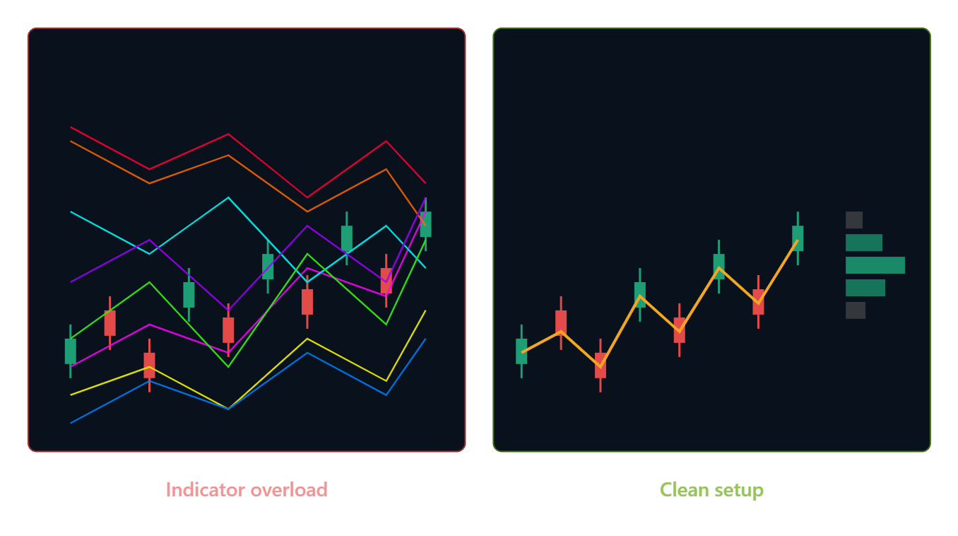
The mistake most beginners make is stacking five indicators that are all mathematically derived from the same input (price), producing five versions of the same signal and an illusion of confirmation. A better approach: one trend filter, one momentum/divergence tool, one volatility tool, and the rest of the picture built from structure and volume.
7. Reading the Macro Backdrop
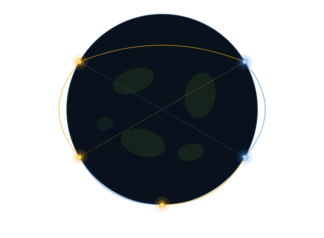
Technical structure tells you where institutions are likely reacting. Macro tells you which direction they’re structurally biased to trade. The two work together — macro sets the weather, technical analysis picks the exact door to walk through.
Every major central bank operates under some version of a dual mandate: stable prices (inflation, typically targeted near 2%) and maximum employment.
When inflation runs hot, the central bank hikes rates to cool borrowing and spending. When unemployment rises, it cuts rates to stimulate credit and spending.
Reading incoming data — CPI, PCE, and PPI for inflation; non-farm payrolls, the unemployment rate, JOLTS, and jobless claims for the labor market — lets traders anticipate which direction policy is likely to move before the announcement, because markets tend to price in expectations well ahead of the actual decision.
Because policy shifts are slow and gradual, they produce exactly the kind of multi-week, multi-month drift that technical structure and volume profiles are built to capture.
A rising-rate environment doesn’t just “feel” bearish for gold — it shows up on the chart as expanding value areas trending lower, breakdowns through low-volume nodes, and repeated rejections at Value Area High.
8. What Drives Each Asset Class
Bonds
A bond is essentially an IOU: lend money to a government or company, get it back later with interest — the yield. That yield is built from the central bank’s base rate, a time premium, a risk/credit premium, and an inflation premium. Plotting yield against maturity produces the yield curve, which normally slopes upward.
When short-term yields spike above long-term yields — an inverted yield curve — it has historically preceded nearly every U.S. recession, making it one of the most reliable macro-technical signals available.
Forex
Currency pairs are frequently traded on technicals alone, but the underlying driver is comparative bond yields. When one country’s central bank turns more hawkish (or less dovish) relative to another, the yield differential shifts, and that shift tends to produce the kind of clean, sustained trend that technical structure captures well — clear breaks of value, retests, and continuation.
Gold
Gold’s core role is as an inflation hedge and safe haven, but it competes directly with bonds for the same pool of capital. The deciding factor is the real yield — the nominal bond yield minus expected inflation. Falling real yields tend to coincide with gold breaking into new, higher value areas; rising real yields tend to coincide with gold stalling or breaking down through prior support.
Stocks
A share represents partial ownership of a company’s earnings and growth prospects. Zoomed out to an index, the stock market becomes a barometer for the economy’s expected earnings power. Corrections tend to show up technically as sharp expansions in volatility (visible in the VIX) followed by mean-reverting consolidation, while sustained bull trends tend to show a stair-step pattern of balance, breakout, new balance, breakout.
9. Following Institutional Positioning
Once a macro-technical thesis is formed, it helps to check whether large institutional players are actually positioned that way.
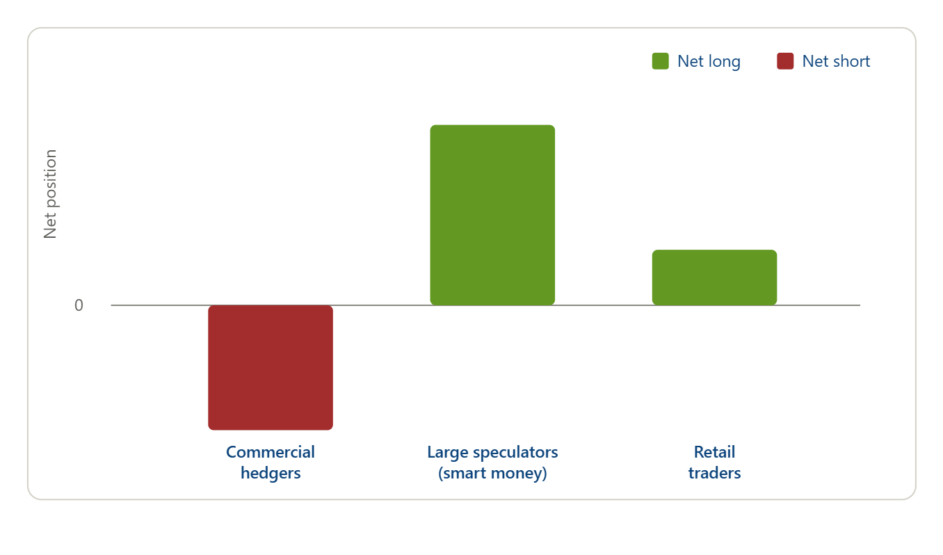
The weekly Commitment of Traders (COT) report, published by the CFTC, breaks down futures market positioning into commercial hedgers, large speculators (the “smart money”), and retail traders — offering a direct read on whether institutions are net long or net short a given market, and whether that positioning is expanding or unwinding week over week.
10. The Entry Models
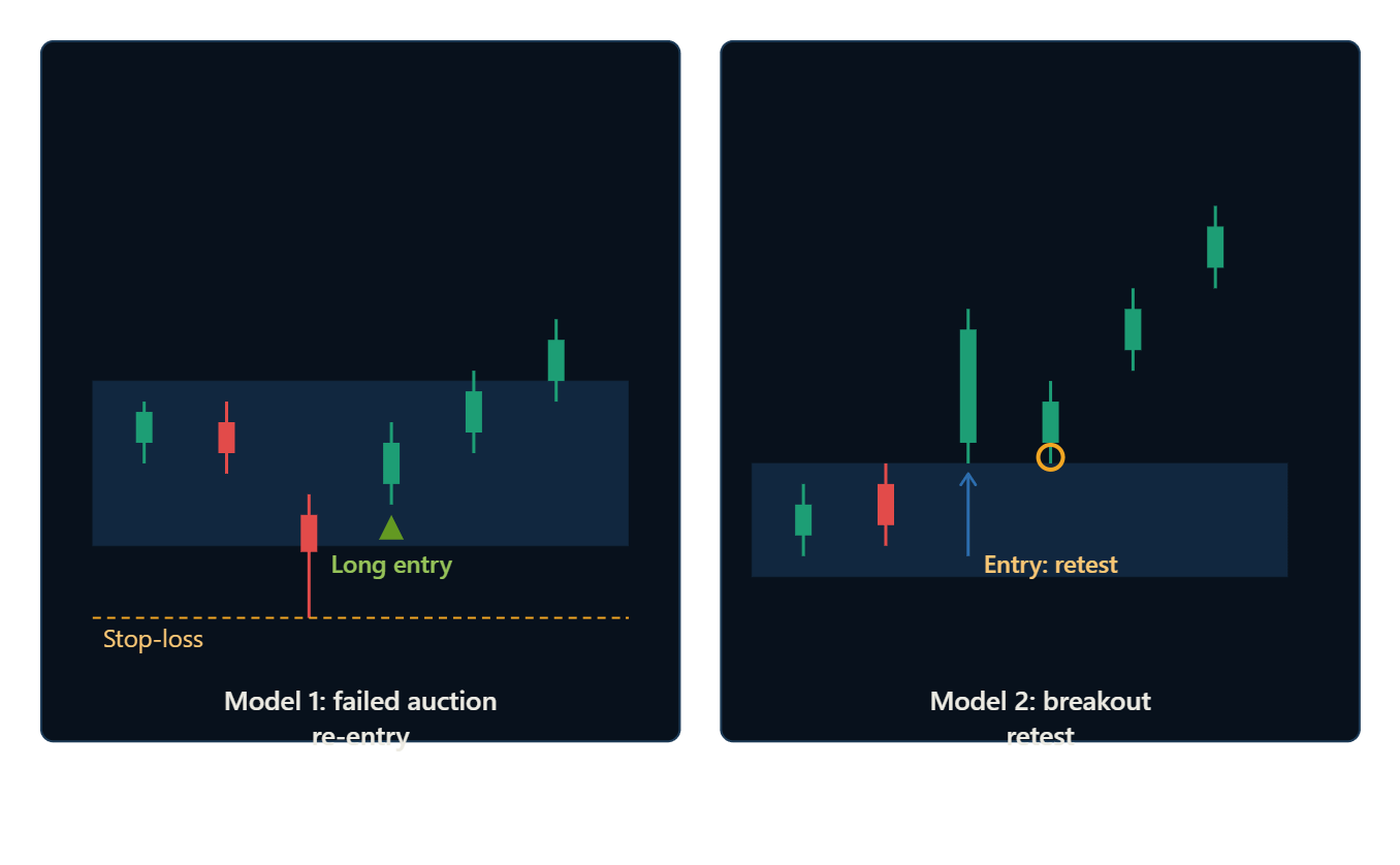
Two entry models come directly out of the volume-profile framework described in Section 5:
The failed-auction re-entry (”break-in”). Price pushes below (or above) a recognized value area, fails to sustain the move, and closes back inside it — signaling that the prior flow of buyers or sellers is reasserting itself. This is typically the highest-probability, best-risk-to-reward entry, because the stop-loss can sit just beyond the failed excursion.
The breakout continuation (”break-out”). After a shift to a new value area, price retests the edge of that new range before continuing in the direction of the drift. This entry sacrifices some risk-to-reward for a higher confidence that the trend is already confirmed.
In ranging markets — common in forex outside of major policy shifts — the same volume-profile logic can instead support a mean-reversion approach, fading moves back toward the middle of an established range rather than chasing a breakout.
A practical checklist before pulling the trigger on either model:
Does the higher timeframe trend agree with the direction of the trade?
Is there a macro tailwind (rate expectations, real yields, risk sentiment) supporting the same direction?
Does COT positioning support or at least not strongly contradict the trade?
Is the entry occurring at a genuine high-volume node or value area edge, not an arbitrary round number?
Is volume confirming the move (expanding on breakout, or drying up on the failed excursion)?
11. Risk Management and Position Sizing
No entry model survives without disciplined risk control. A few non-negotiable principles:
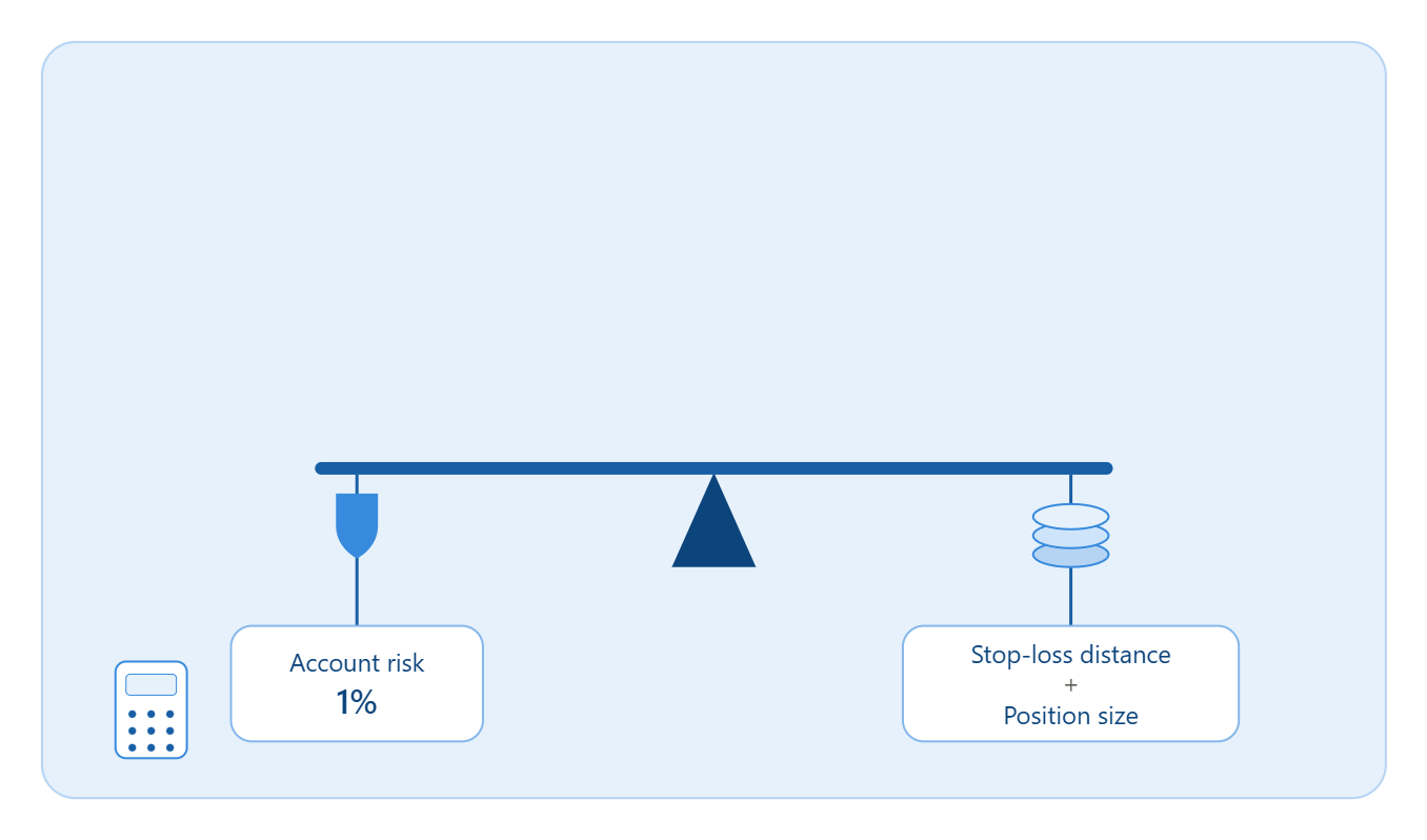
Risk a fixed, small percentage of capital per trade — commonly 0.5% to 2% — regardless of how confident the setup feels.
Let the stop-loss define position size, not the other way around. Identify the technical invalidation point first (just beyond the failed auction, or below the retested breakout level), then size the position so that a stop-out only costs the predetermined risk percentage.
Use ATR to normalize stops across volatility regimes. A stop that’s appropriate in a calm range will be far too tight during a volatility expansion, and vice versa.
Plan the reward before the trade, not after. A setup with an unclear or asymmetric reward relative to its risk isn’t a setup — it’s a guess.
Correlated positions count as one trade for risk purposes. Being long two currency pairs both driven by dollar weakness is really one dollar bet, not two diversified ones.
12. Building a Trading Plan
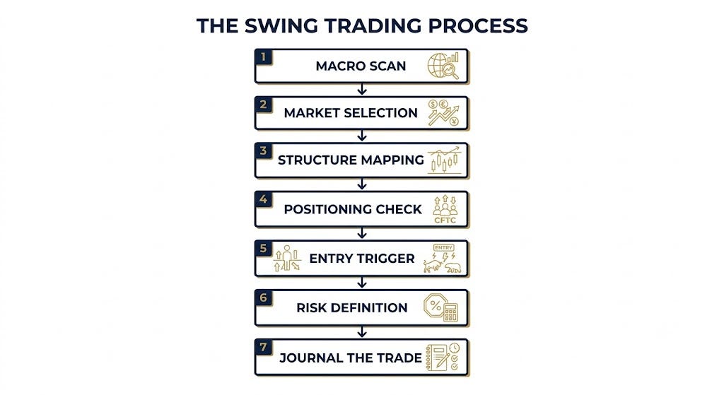
A repeatable process beats a brilliant one-off idea every time. A simple structure that ties everything above together:
Macro scan — check the current rate-hike/rate-cut expectations, inflation and employment trends, and overall risk sentiment.
Market selection — identify which asset class has the clearest macro tailwind right now (bonds, forex, gold, equities).
Structure mapping — mark the higher-timeframe trend, key value areas, POC, and VAH/VAL on the chosen instrument.
Positioning check — confirm COT data isn’t fighting the thesis.
Entry trigger — wait for either the failed-auction re-entry or the breakout retest, on the timeframe used for execution.
Risk definition — set the stop at the technical invalidation point, size the position from the fixed risk percentage.
Journal the trade — record the thesis, the entry logic, and the outcome, win or lose, to build a genuine statistical edge over time rather than a collection of anecdotes.
13. Common Mistakes and How to Avoid Them
Trading against the higher timeframe trend because a lower timeframe pattern “looks perfect.” The lower timeframe pattern is almost always noise relative to the dominant drift.
Ignoring volume entirely and trusting a breakout on price alone. Price without volume confirmation is only half the story.
Stacking correlated indicators and mistaking agreement between them for genuine confluence.
Moving stop-losses further away mid-trade instead of accepting the original invalidation point was hit.
Sizing positions based on conviction rather than the stop-loss distance, which turns a well-planned setup into an oversized bet.
Fighting the macro backdrop — taking a technical long in an asset class with a clear structural macro headwind, and vice versa.

14. Final Thoughts
Technical analysis, done well, isn’t about memorizing patterns — it’s about reconstructing where large, slow-moving capital is likely positioned and reacting, using volume and structure as the evidence trail, and using macro context to lean the odds in a consistent direction over many trades.
None of this guarantees a winning trade — no framework does — but it reframes trading around genuinely persistent, well-documented mechanics rather than short-lived retail patterns that tend to stop working as soon as enough people notice them.
Disclaimer: This article is for educational and informational purposes only and does not constitute financial advice. Trading involves substantial risk of loss, including the potential loss of principal. Always do your own research and consider consulting a licensed financial advisor before making investment decisions.